What are quick improvements for the gift card page?
The marketing and business team approached UX with an urgent request to redesign the gift card page. They had decided to switch gift card vendors, which allowed them to consolidate their purchase flow, but the current page would not reflect the change. They expected it to be a quick wireframe that housed the new process, and we delivered what they expected and a little more.
Business Constraints
- The two separate purchase flows for gift cards will be consolidated into one.
- The new purchase flow will be moved to a third-party vendor where we have limited control.
- There is a max two-week timeline for design, in order for development to meet the switch deadline.
Due to timeline and business constraints, I used a combination of market research, web audit, and unmoderated usability testing to draw research insights within a week. This allowed for a week of design, collaboration with our visual designer, and reviews before hand-off to development.
Usability testing revealed up-front information needed for gift cards.
I devised a research plan and conducted unmoderated usability tests with 10 participants split between mobile and desktop, and screened for participants who reflected our prospective customers. The tests were done through UserTesting, who also provided the participants.
The usability test aimed to answer the following questions:
- How effective is our current Gift Cards page?
- What information do our customers need to move forward with their purchase decision?
Sample Questions
- What delivery option did you choose? Why did you choose that delivery option?
- In your own words, describe what the gift card can be used for?
- (On a scale of 1-7 with 1 being Strongly Disagree) The gift card purchase process is easy to use. Explain your answer.
Participant Quotes
"It's frustrating to have to call for information that should be available to everybody."
"It was a lot of information to parse through. The delivery time of everything could be a bit more up front."
Secondary research showed opportunities to improve the gift card page
Along with synthesizing usability tests, I conducted a UX audit on the existing page, as well as market research of other brick-and-mortar retailers.
Top insights:
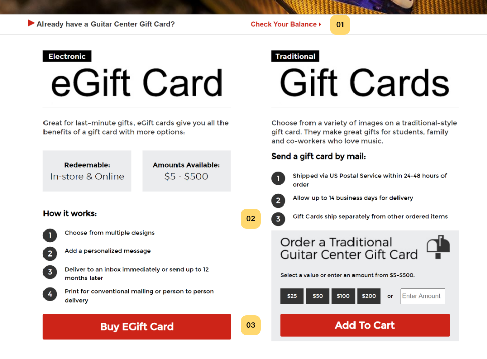
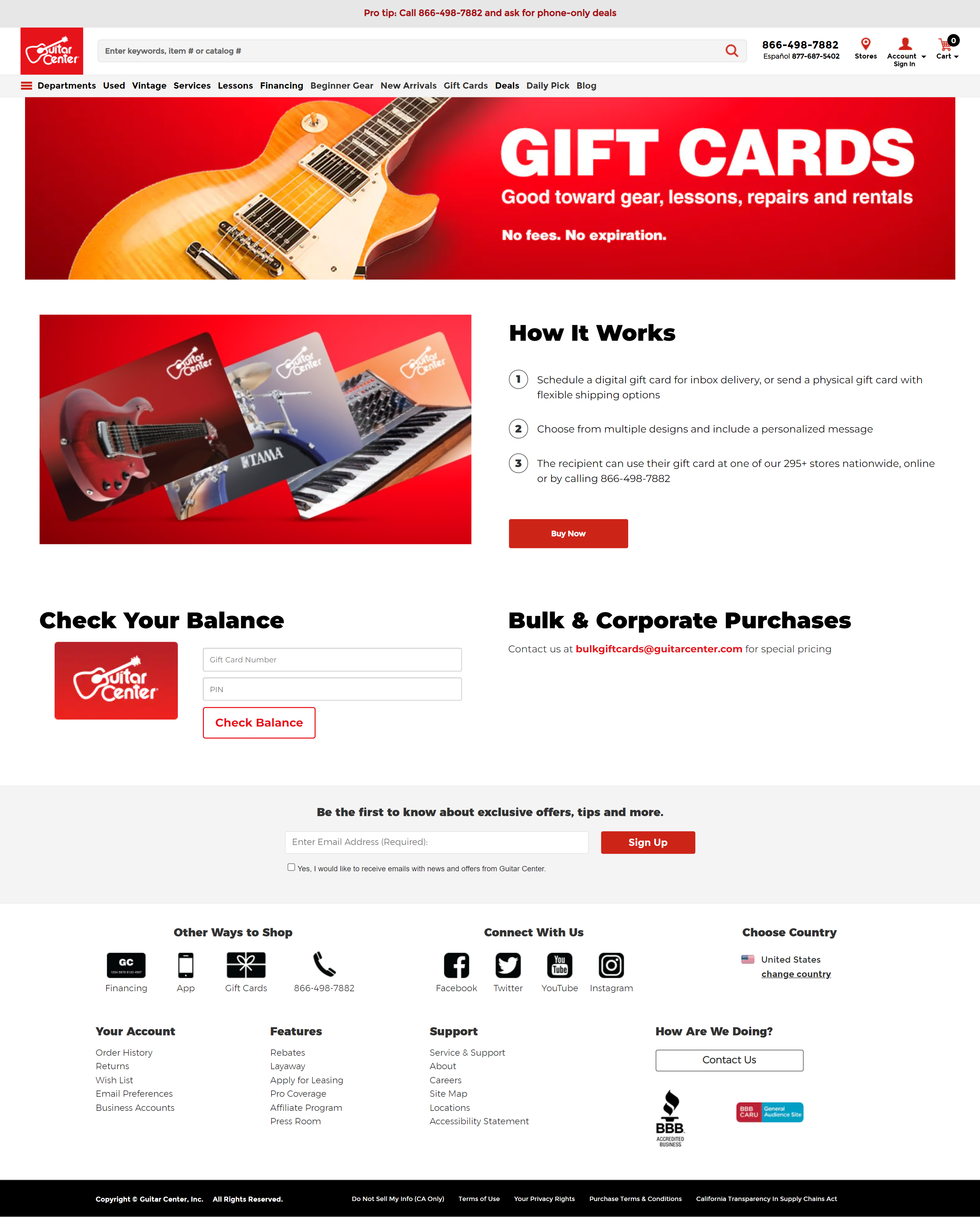
Designed a straightforward, informative gift card page
Based on the findings from the user research, and the concerns and constraints that came up during our stakeholder workshop and reviews, I created several hi-fidelity wireframes. With stakeholder input, we decided on a final.
Key Features:
Collaboration led to the smooth launch of the new gift card page
The hi-fidelity wireframes I created with our visual designer allowed our developers to replicate it one-to-one for the web without issues.
The final web design resolved the following issues:
- Include clear, upfront information about how the gift card can be used.
- Increased digital gift card values based on feedback.
- Allow users to check gift card balance directly in the gift card page.
Retrospective
Due to the time constraints, I was not able to conduct usability testing on the new layouts before production. Instead, we chose to watch metrics after launch and re-evaluate after.