Research
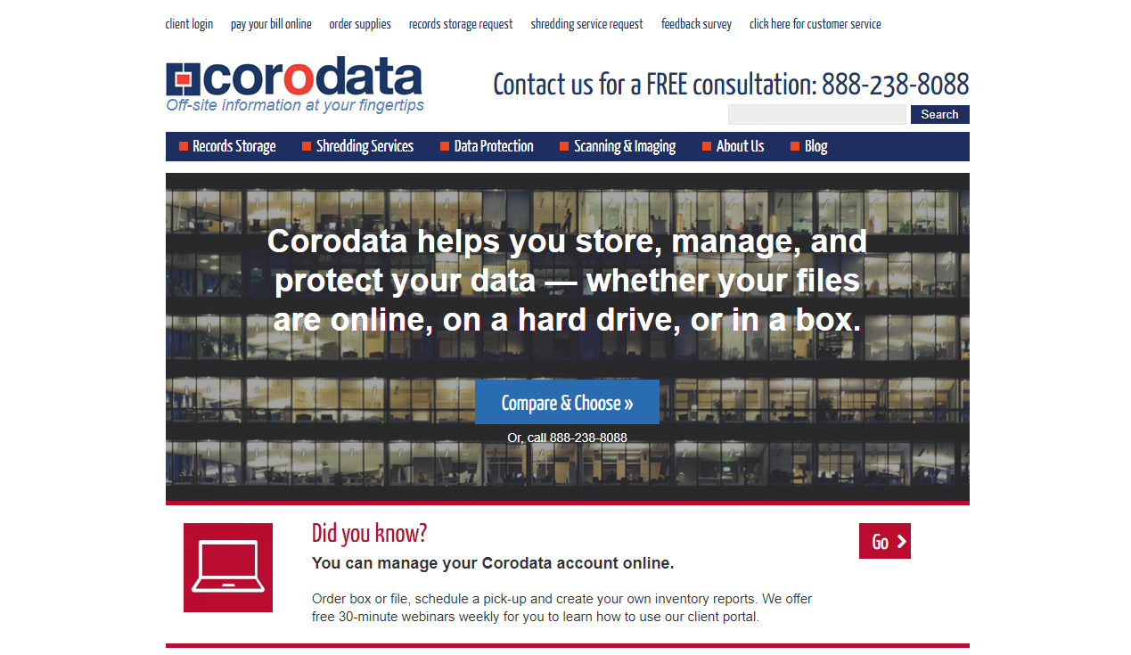
The previous website was built for more informational services and generating organic traffic through content marketing and SEO. Since most of the transactions were done through phone, there was little emphasis on creating an online customer experience.
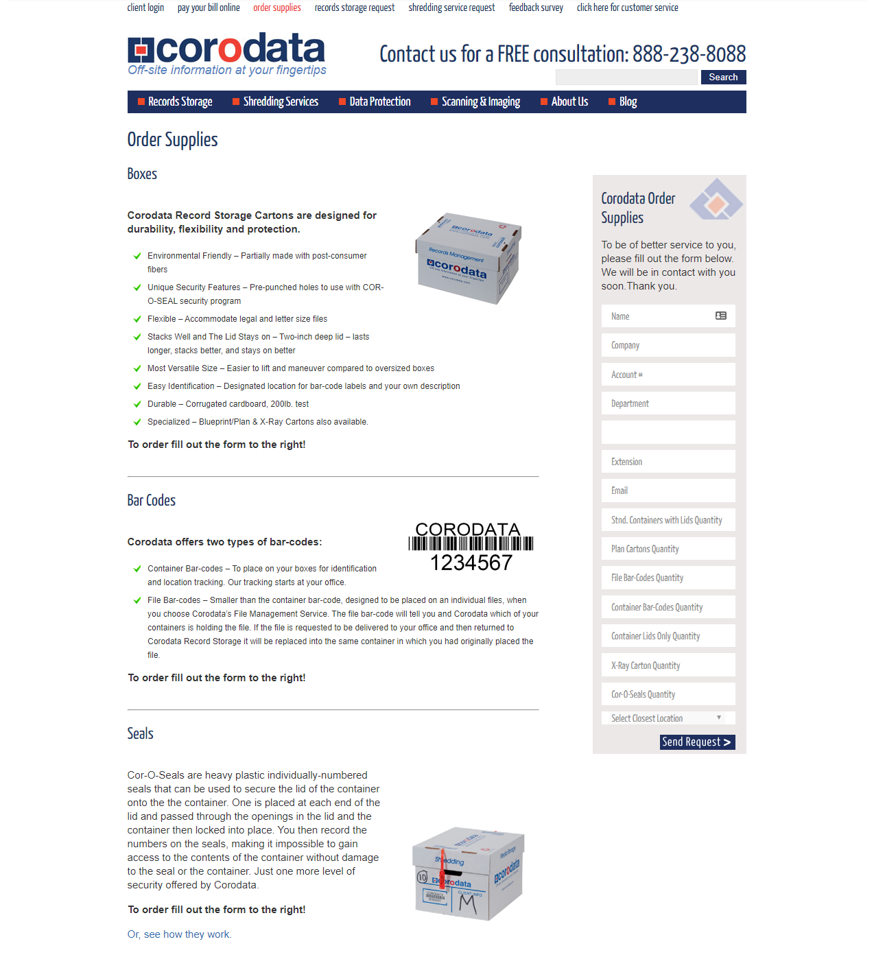
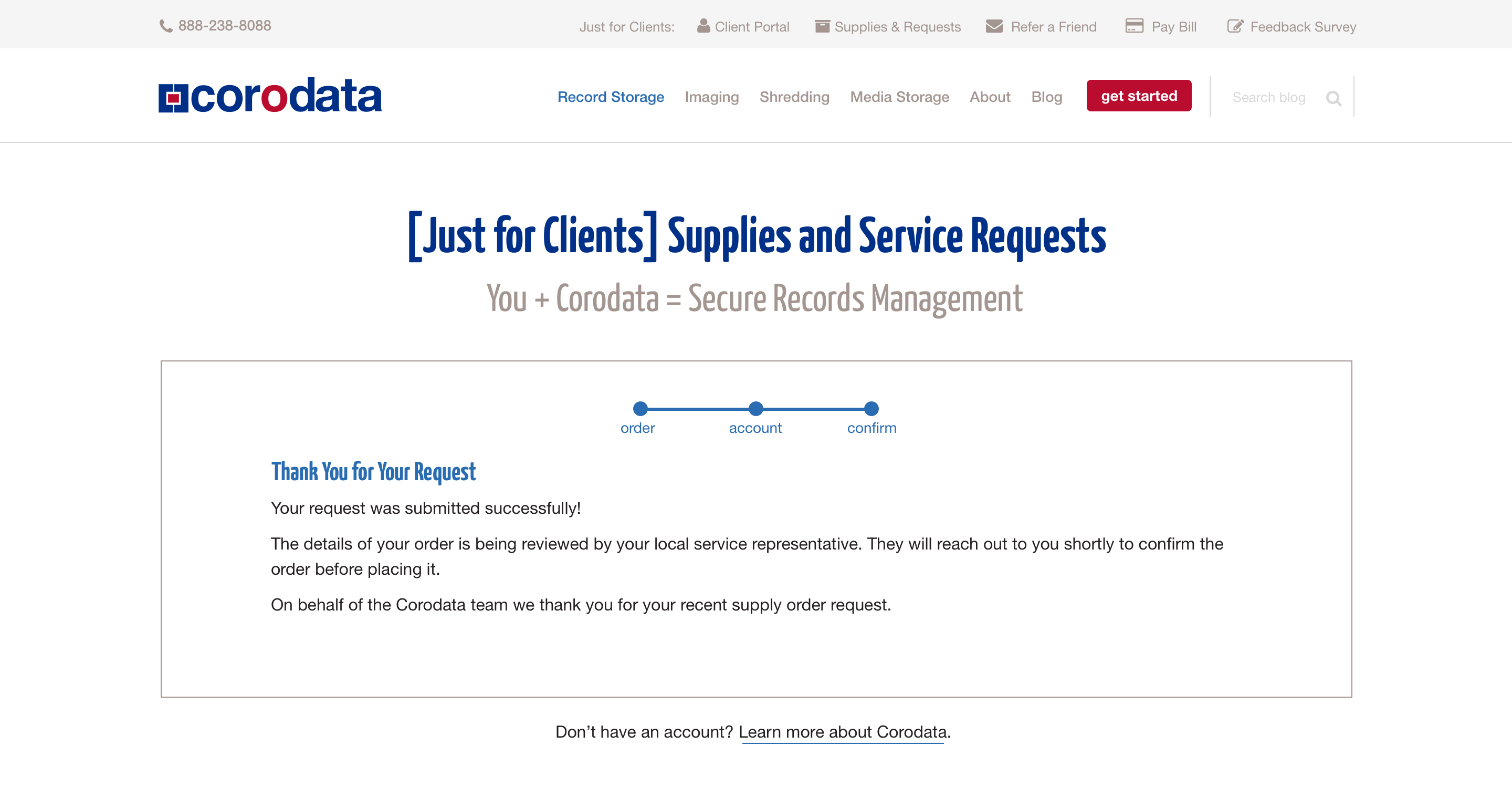
Supply and Services Request Form
Problem
I did a UX audit on their form and found the following problems:
- The purpose of the page looks to inform customers about their products, instead of ordering supplies, which is the main objective.
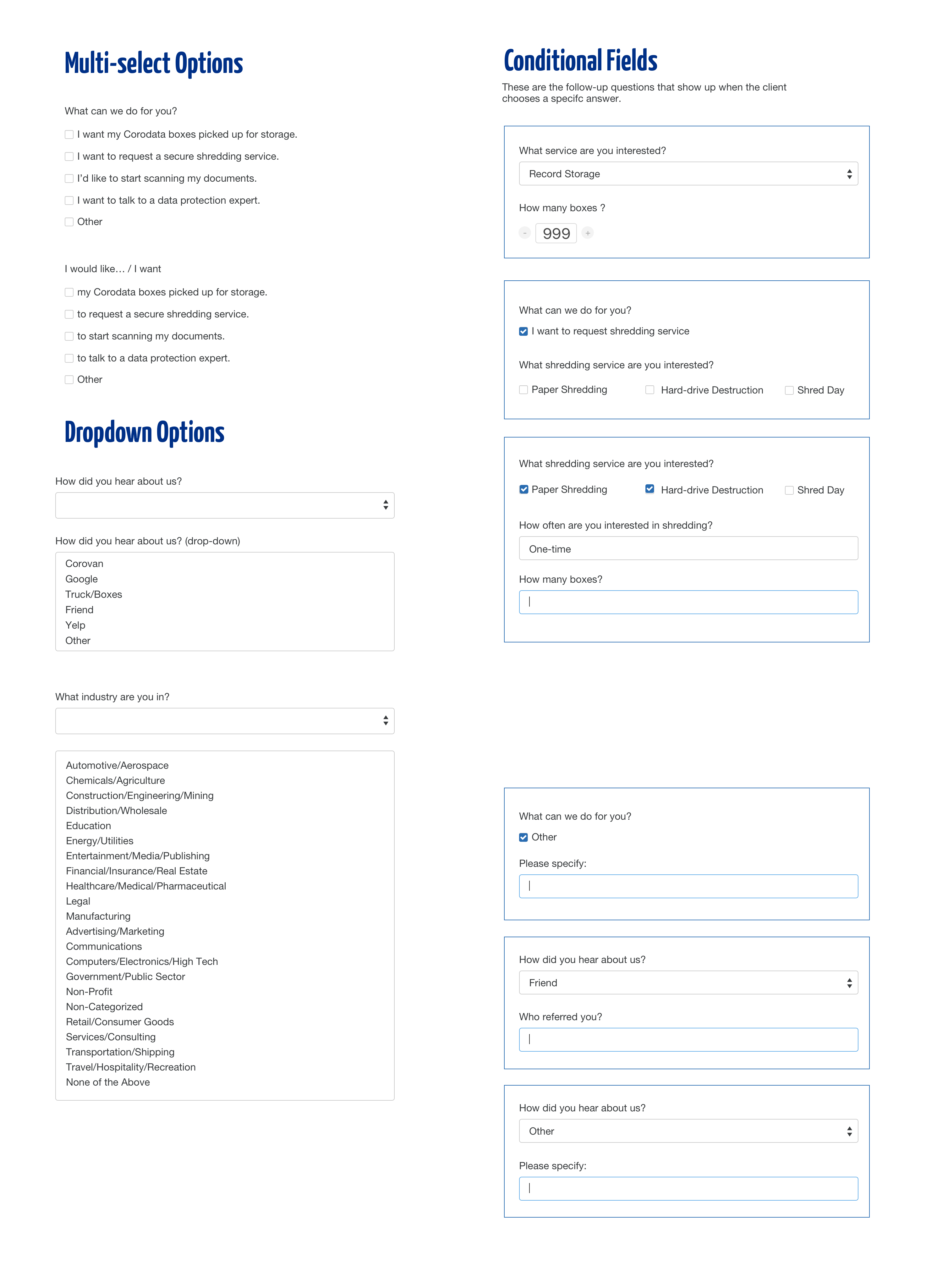
- The form tries to capture too many pieces of information at once, resulting in an intimidating and hard-to-fill form.
- This page can be accessed by anyone, instead of just customers, resulting in invalid submissions.
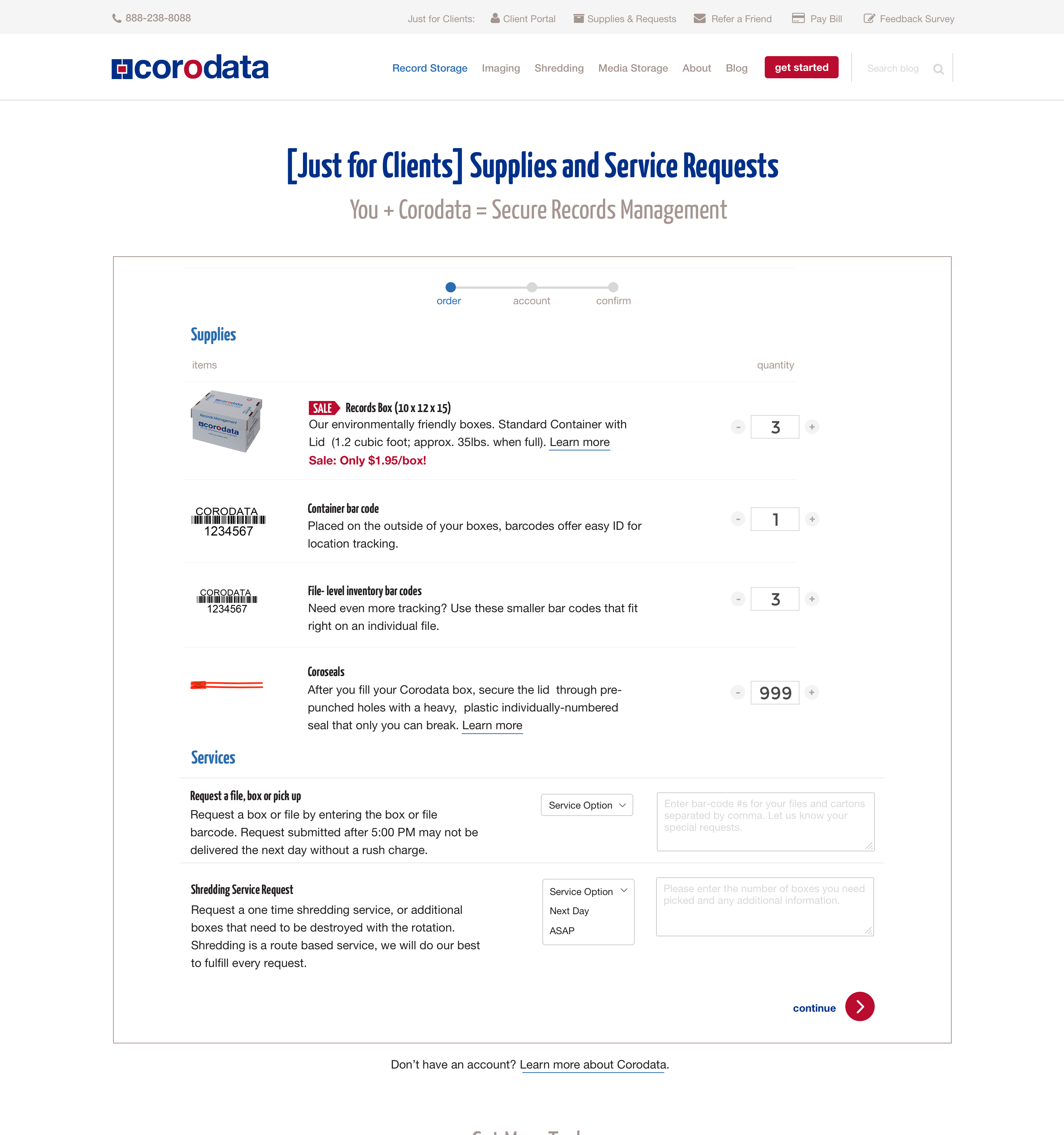
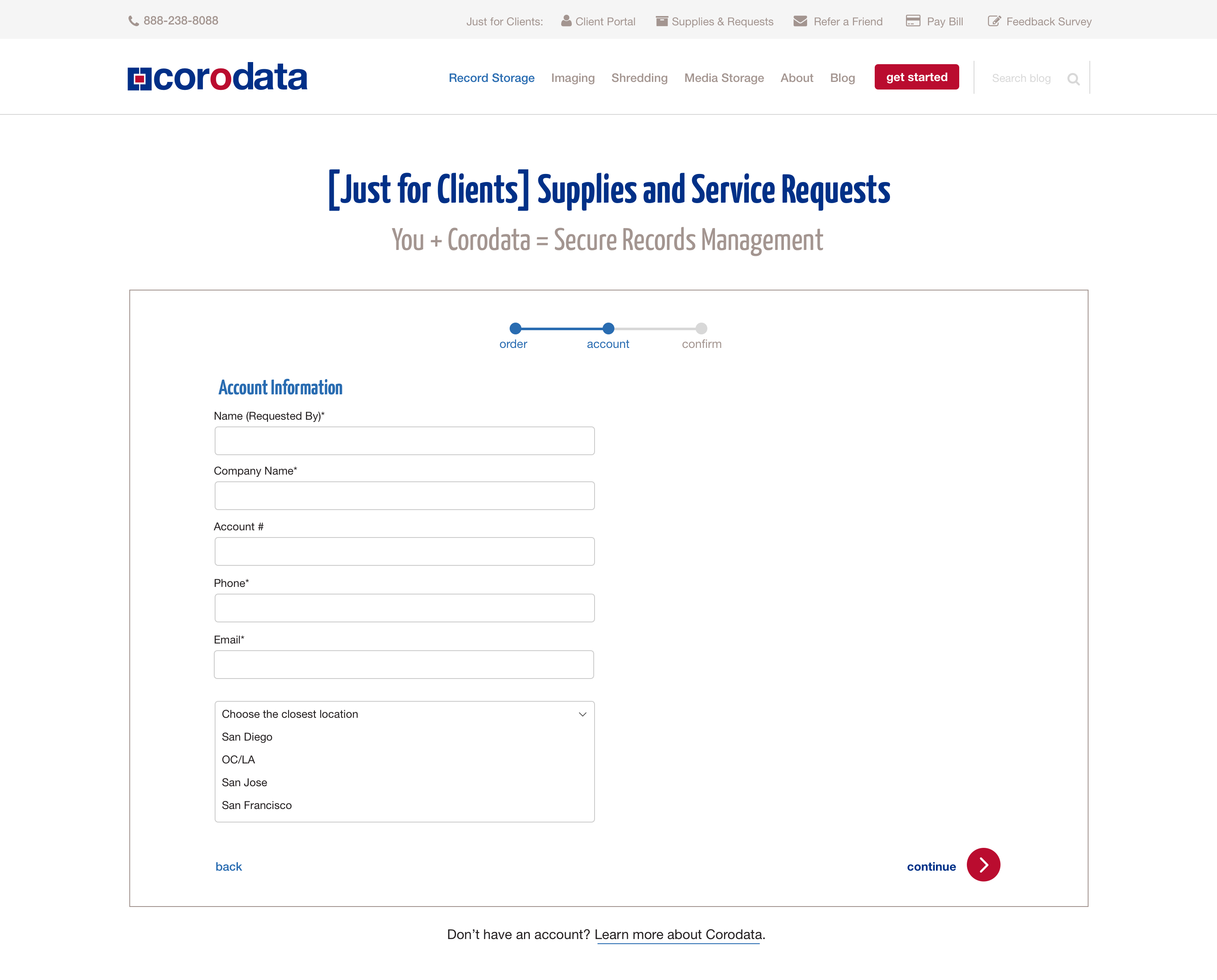
Solution
I separated the order process into three parts:
- Supplies required
- Account information
- Confirmation
By doing so, we allow customers to get in-depth information about supplies and services while they are submitting the form without overwhelming them.
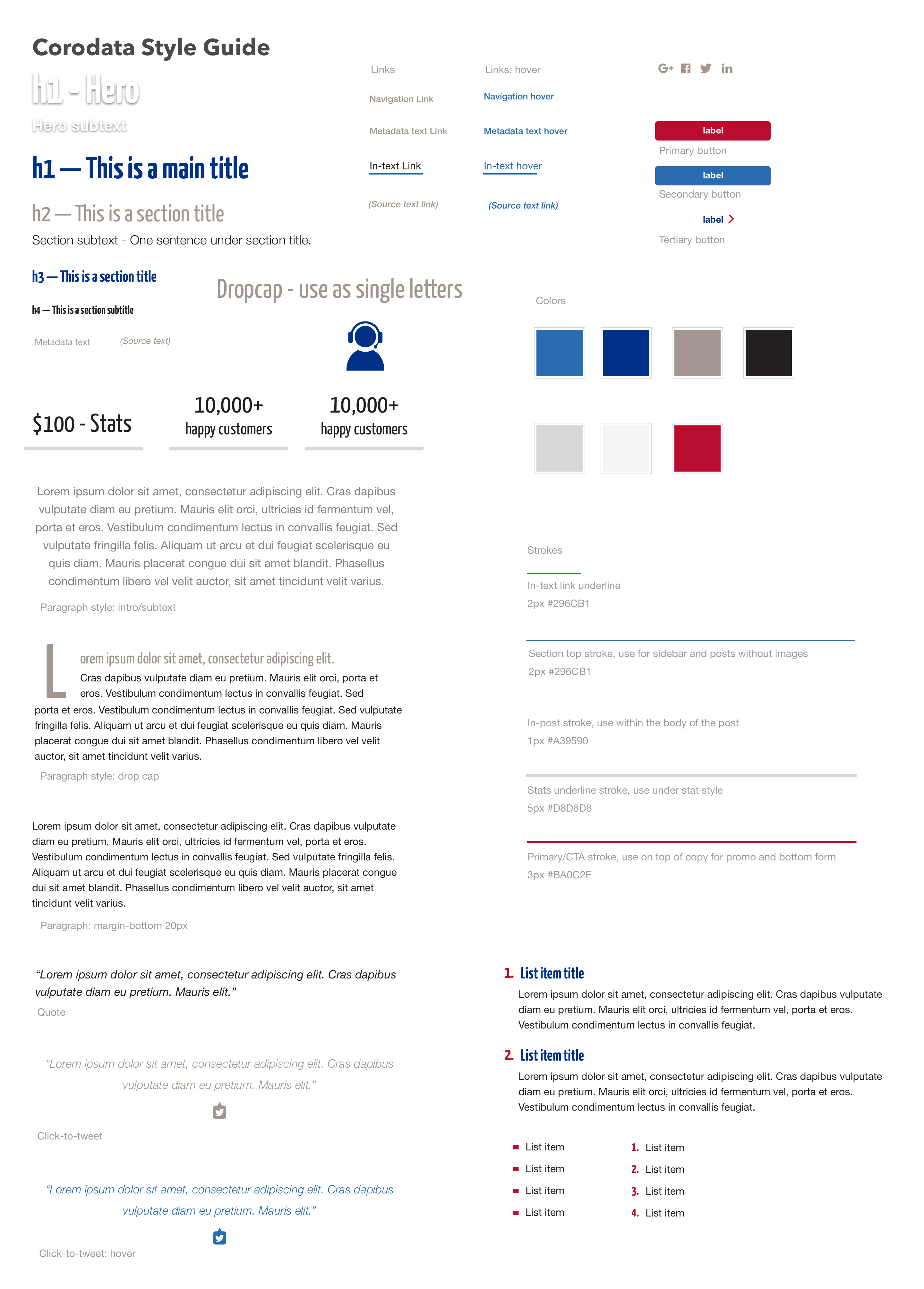
Modular Design System
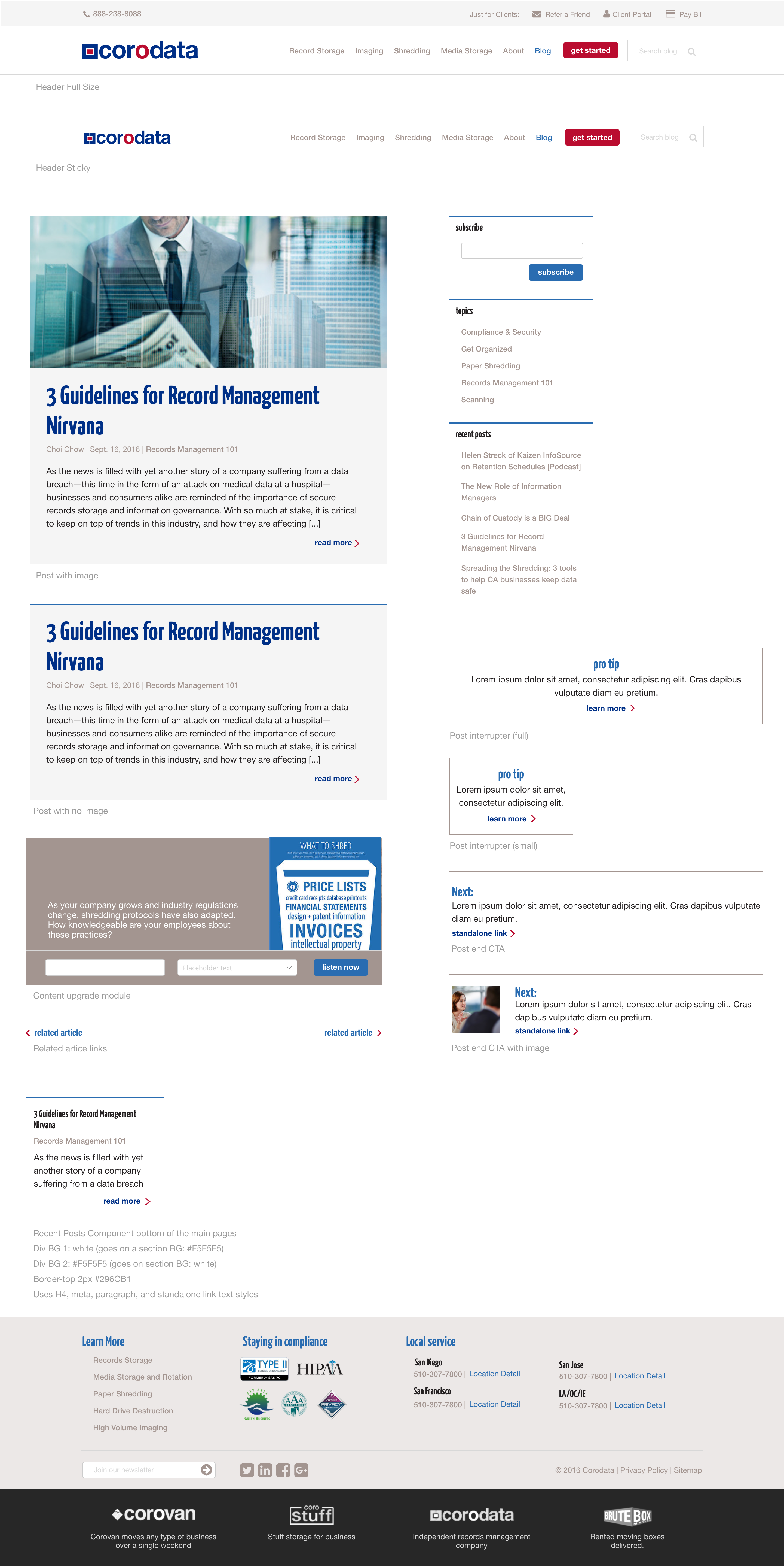
I created a style guide comprised of modular sections that the developer could use while restyling the website. I also worked with the developer to create a components page that included the elements and code snippets that their in-house marketing team/producers could use to style their blogs with.
I redesigned the header to create a clear delineation between client portal navigation.
I also created a guide for all of the components that would be used on the main site.
Outcome
The new design system allows the future web updates to be on-brand, cohesive, and responsive.
The redesigned forms offloaded some of the traditionally phone-based customer requests, while maintaining a level of customization and service to returning customers.
See Live Site