Background
When I joined Guitar Center, the team was already in the middle of redesigning the product detail page as part of their website optimization roadmap. Initial research on the overall customer journey had already been done, but key features had yet to be redesigned. I onboarded quickly, and familiarized myself with the Guitar Center processes and styles, as well as general ecommerce UX best practice guidelines through Baymard and NNG reports.
For this project, I researched and designed several key features of product detail page, including the store locater, stock availability, and wish list functionality. I also worked collaboratively with our senior UX designer, Keith, on the page styles, prototype, and production hand-offs. For the features I took lead in, I created the user research, synthesis, and wireframes.
Research
Due to strict timelines and owning multiple key features, I had to split between doing qualitative user research and market research of various industry of e-commerce websites that share that have physical stores that do both pickup and delivery. I also did best practice research using Baymard and NNG UX guidelines. To better understand how Guitar Center customers interact with our site, we did evaluative usability tests on the store picker and PDP.
I created and ran unmoderated evaluative usability tests through UserTesting. I synthesized research sessions by listening to each session and coding the interviews by comments and sentiments using tags on the Usertesting platform.
Three main insights:
- Participants had a hard time distinguishing between items that can be shipped and items available in store.
- The highest priority information for participants buying for pickup is the item availability, distance from them, and store hours.
- Their willingness to travel for an item is dependent on the value of an item (ie. 100 miles for a limited quantity guitar vs 20 miles for accessories).
Participants were confused about the in-store availability because the shipping and delivery information took up to 10s to load.
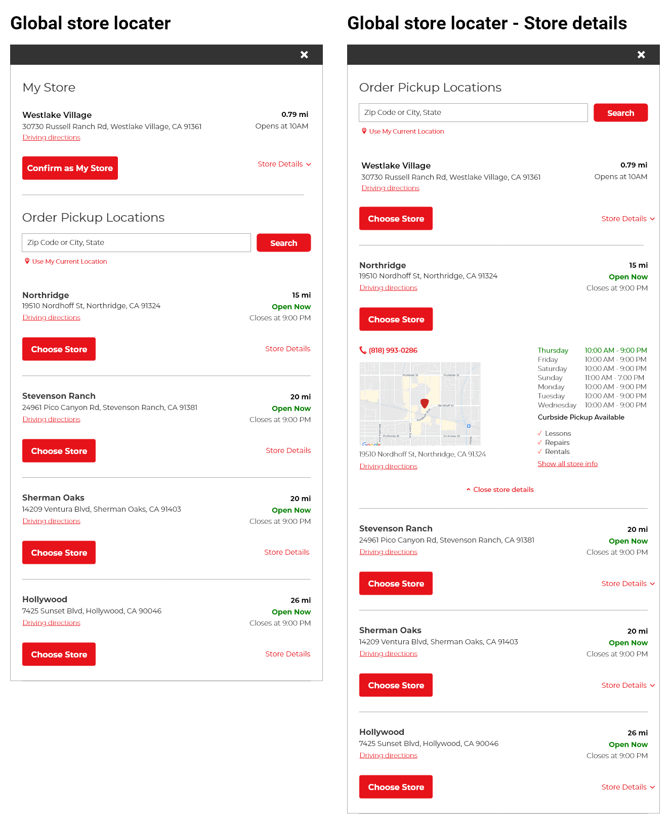
Store Locater
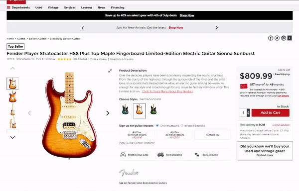
Product Page
Based on the findings from the user research, and our stakeholder reviews, I created hi-fidelity wireframes.
Three key features of the new layout includes:
- A clear indicator of their current store.
- A way to change the pickup location based on where they lived.
- A way to filter out and show only stores that had the item available.
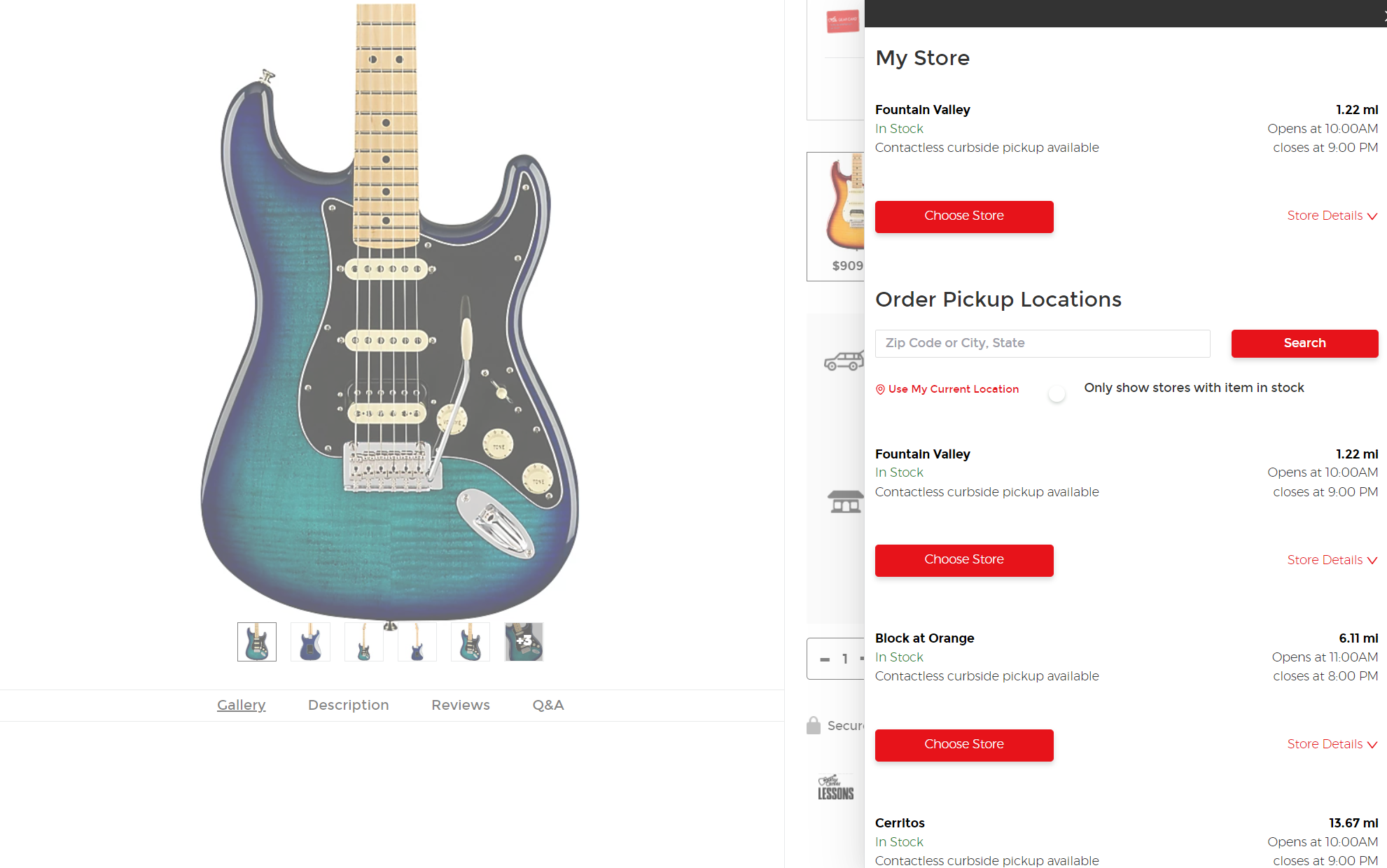
Global
- The ability to set a store as home store, which can let users filter inventory by store.
- Prioritize store address and directions.
- Show which stores are currently open.
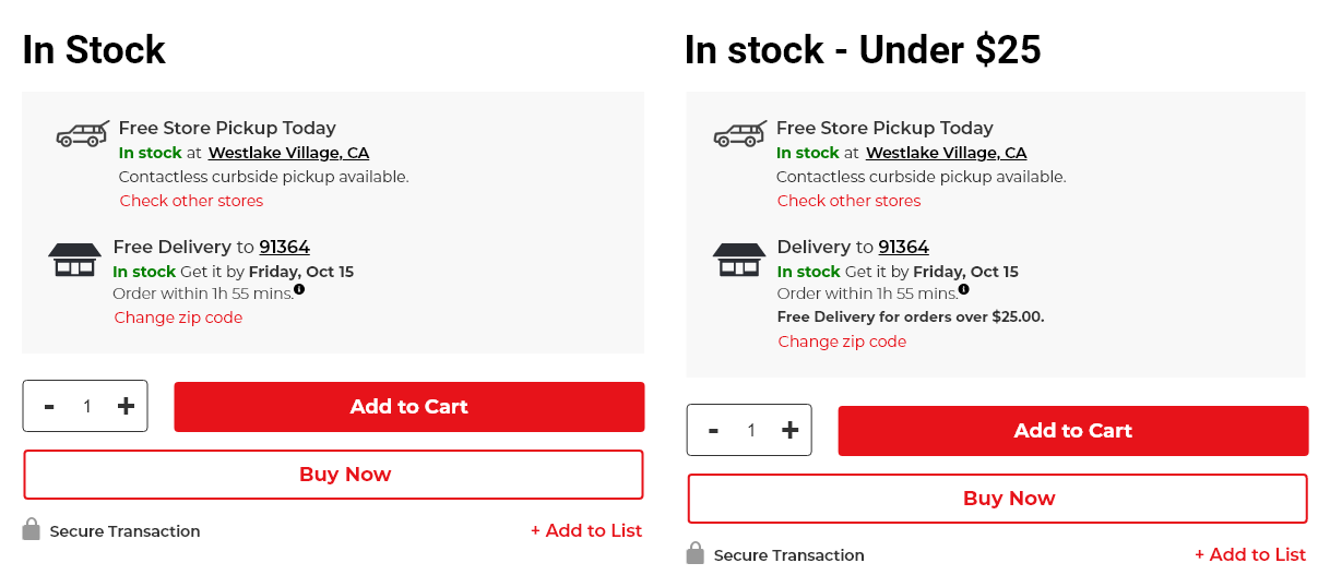
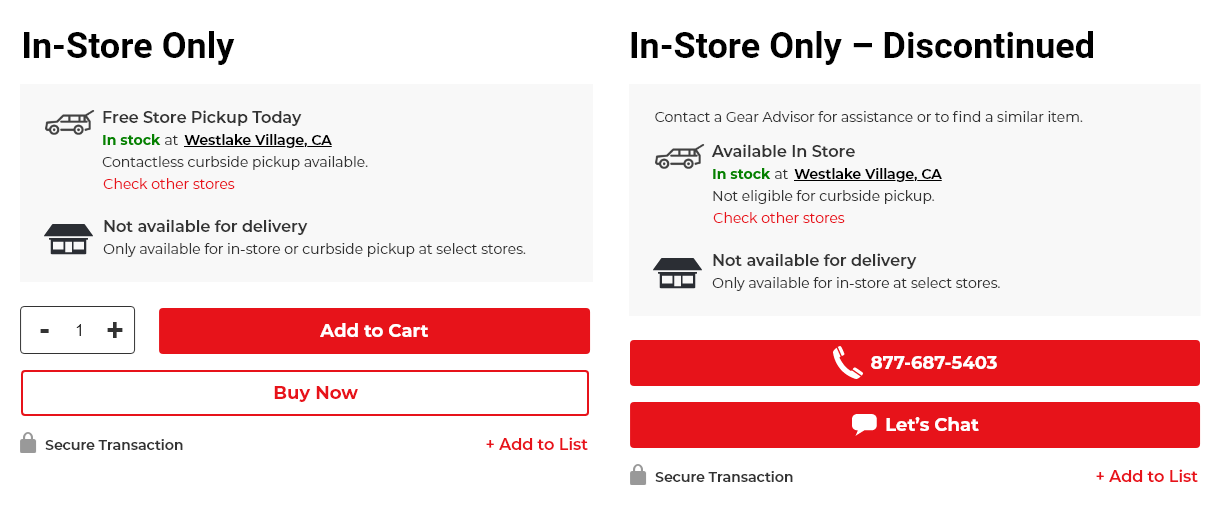
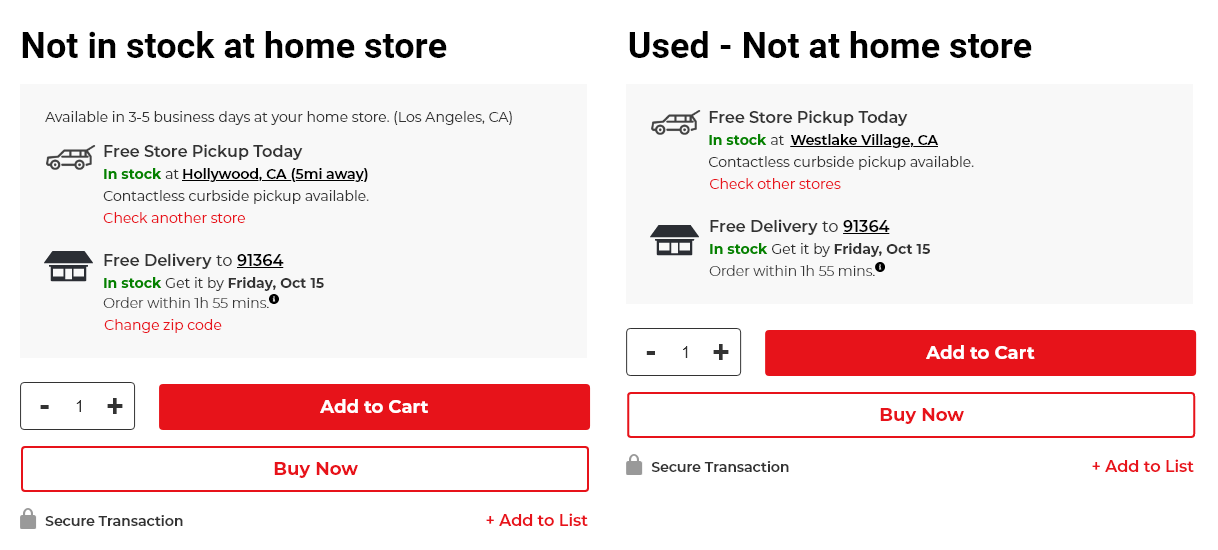
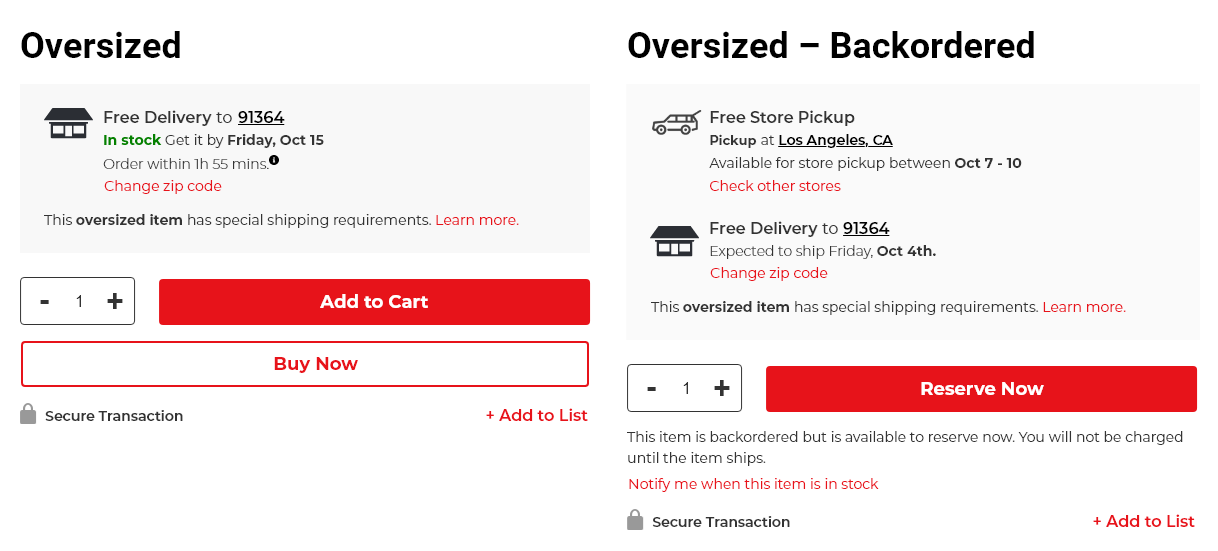
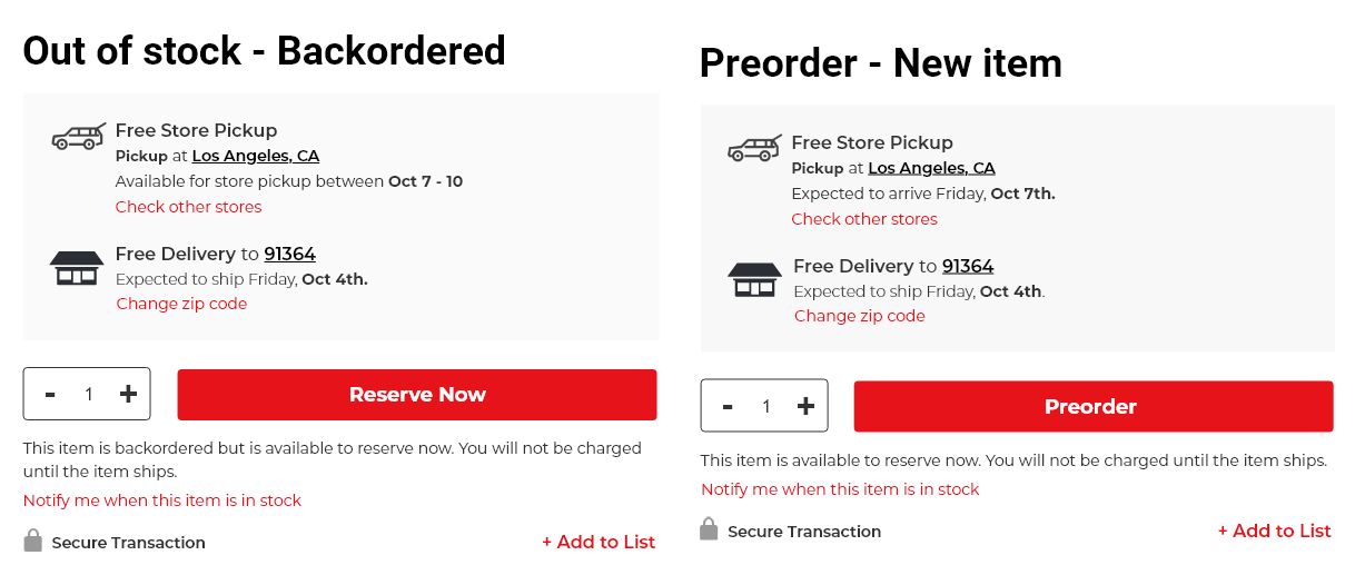
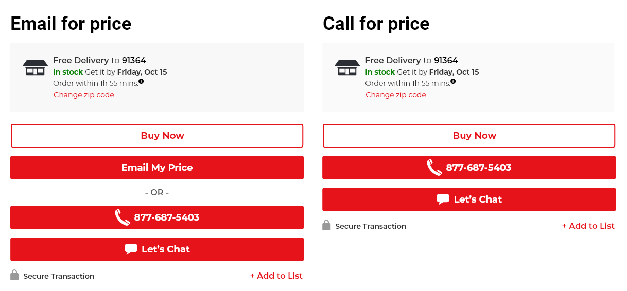
Product Availability
For product availability, I conducted multiple interviews and reviews with the business stakeholders because they had a deeper knowledge about product codes, which dictate everything from availability to special delivery circumstances. With this information, I was able to design a system that covered all of the various instances.
Three key features of the new layout includes:
- Standardize availability language, instead of using 'In Stock' for delivery and 'Available' for pickup.
- Give availability for both shipping and pickup before the 'Add to Cart' button.

Add to List
UX Audit
The initial 'Add to List' feature did not fit with the browsing flow of the product detail page. It was also gated behind an account creation, which lowered the customer's likelihood of using it.
User Flow
In order to make the most out of the 'Add to List' feature, I made a few flow recommendations.
- Stop gating users when they want to save an item to a list.
- Create a temporary list that allows users preferences to be saved via cookie.
- Encourage users to create accounts if they wish to save or share lists.
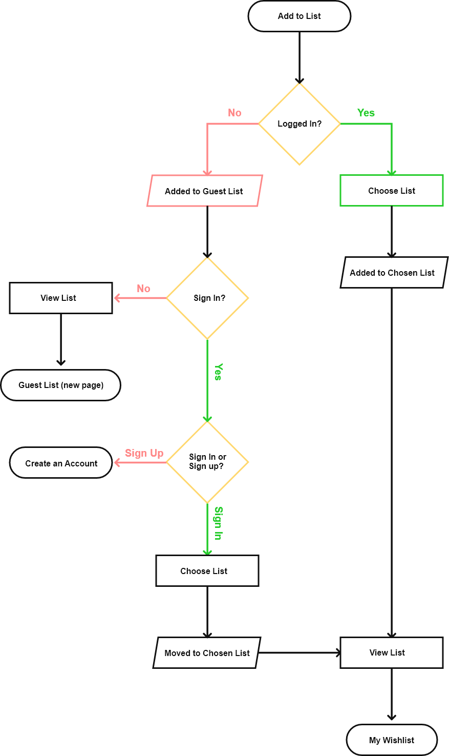
Wireframe
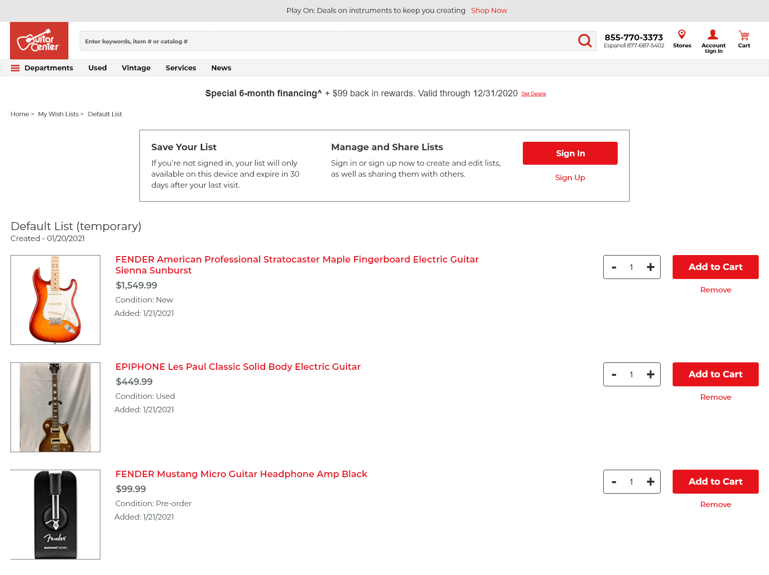
I created a wireframe for how the temporary guest list would encourage users to sign up for an account.
Although the wishlist feature was not considered the priority for the PDP, because it's core functionality lived under accounts, I included it as part of the customer's purchasing journey. It would be developed in phase 2 of the website redesign, along with other accounts feature.
Outcome
The new PDP has been implemented and is already started showing great results. The success of the PDP and new design system allowed other key projects, such as the new header to move forward. The following are a few key analytics a month after implementation:
Conversion Rate
+12.8%
Revenue Per Visit
+19.6%
Average Order Value
+5.9%